Wednesday 14 November 2012

REED AND RADER @ 18 HEWITT STREET

'When you enter the space you will smile. When you leave the space you will love dinosaurs.'
-Reed and Rader

Super-charming duo Reed and Rader this week came over to London for the first time to stage an exhibition at trendy Prote.in HQ 18 Hewett StreetThe New York duo famed for their bright, glitchy GIFs refashioned  the East London location as a prehistoric party house, staging large-scale projections and sound and video works in a space populated on- and off-screen by…dinosaurs. Around their prehistoric/futuristic GIFs, they lined the white gallery walls with paper cut-out grass and tropical plants, and imported over from New York a massive paper dinosaur friend.
 The opening night was a dino-extravaganza with videogame-graphics, dancing and dining on the digital artists’ favourite food – pizza – served up wood-fired style from bespoke street food company Bosco and Bee. 


Reed and Rader’s work is undeniably, unapologetically fun. They push the GIF, perhaps the first real art form of the internet, to its faux-futuristic limits, creating dynamic and deadpan imagery that never takes itself too seriously. Inherent in their work is a bittersweet nostalgia for the simple pleasures of the early internet age – the happy-go-lucky Moldy Peaches era when Pokémon cards and Gameboys, pizza, kitties and cartoons were king.

And yet, beyond their spacey amusements-arcade of imagery there is the potential for more serious discussions about the ways in which new technologies are to direct the future of art and art-making. Just as the prehistoric, the nostalgic and the futuristic are jumbled in this new exhibition, so are the categories of fashion, advertising, technology and art, converging to form a new breed of post-Pop art. Reed and Rader don’t only question the boundaries of ‘high’ and ‘low’ art but disregard them all together - with the irresistible audacity of teenagers. 

Cretaceous Returns is only on for a week: catch the duo and their dinosaurs before they party on back over the Atlantic. Their show at 18 Hewitt Street runs from 8th – 20th November.


(adapted from an article for The Cultural Expose)

***


When I spoke to Matthew Rader about what I was writing, I discovered that he hadn't actually heard of the Moldy Peaches (?!) The photographer at the preview apparently caught me harping on about them to him. 


Monday 12 November 2012

STIFTER'S DINGE - HEINER GOEBBELS @ AMBIKA P3

An astoundingly original sound-installation-sculpture-performance from German contemporary composer Heiner Goebbels. Powered on some level by idol organisation ArtAngel. Runs until 18th November. 


If ever there was an organisation that had its proverbial finger firmly on the pulse of cutting edge contemporary art forms, it is commissioning body Artangel. This month, the team that brought us Roger Hiorns’ sparkling azure ex-council flat grotto and Rachel Whiteread’s full-size casting of her own House have orchestrated the delivery of another extraordinary project to the heart of subterranean London: Heiner Goebbels’ Stifter’s Dinge.
Having travelled across the world, this remarkable ‘performative installation’ returns to its original home at Ambika P3, Marylebone Road. The massive monolithic interior of the former concrete testing facility has once again been transformed to become Goebbels’ cavernous laboratory of sound and light.Stifter’s Dinge defies definition: it is at once a theatrical performance, a visual spectacle, a musical sculpture – and yet it is none of these things exclusively.
A towering structure blinking with LEDs supports five pianos which appear to play themselves, singing out short melodies which combine and blend with the clanking and clunking of other components in the installation. Bodies of water bubble and ripple with the reverberations of sound; a thin mist hovers across the scene. Lights flash and dance across the space, casting abstract patterns on vast gauze screens that lower themselves from the ceiling at various intervals. Phantom-like voices hauntingly play out over projected images of idealised landscape paintings. At times meditative, at times unsettling, the experience is totally mesmerizing.
The title of the work translates as ‘Stifter’s Things’, after nineteenth-century writer Adalbert Stifter who was (in)famous for his fastidious, vividly detailed descriptions of nature: part of his attempt to close the gap between the ambiguity of language and the reality of experience. Goebbels uses similar tactics of immersion in his ‘no-man show’. The contemporary composer created this piece for instruments, not their players; and as the only human presence in the room, the audience is made to focus on the objects themselves which appear to perform autonomously.
This is a project to experience, not one to read about. Stifter was right – sometimes language just doesn’t have the capacity to adequately describe nature (or a multi-faceted, sensory-immersive installation). Artangel never fail to deliver the cutting-edge of cool – the newest addition to their list of weird and wonderful projects is no exception and should not be missed.
(Written for The Cultural Expose)


Thursday 1 November 2012

ART OF CHANGE: NEW DIRECTIONS FROM CHINA @ HAYWARD GALLERY


Crouch to enter a small arched opening to find a small Chinese woman wandering as if lost around a small space inside. She sings short, breathy notes into the semi-darkness. She comes up close, and after folding and unfolding several dog-eared slips of paper, whispers, as if confidentially: ‘I read---the Happy Prince---did you read this story? ---I draw lot of --- inspiration from---.’

Climb out of this otherworldly space to find a small girl in slippers and striped pyjamas waiting for you, staring straight ahead. She follows you for a short time: just a few feet behind, never looking directly at you but horribly present. At one point she drifts away but you don’t notice where she goes.

A live statue frozen in mid-fall, blinking passively upwards; silkworms that hiss and chatter through headphones that hang from the ceiling like maggots from a tree; a golden tower of human fat; a piece of meat on a pedestal, slowly oozing two pools of grey-blue blood.

If these sound like the surreal components of a bad dream, that is what it was like. In reality, it was the Hayward Gallery’s Art of Change, an exhibition showcasing of the work of nine contemporary Chinese artists dealing with the idea of change: the unstable, the impermanent and the volatile.

I could have written a soul-searching post about the visual links to established Western artists (Orozco, Hesse, Bourgeois, Long) and what this meant (problematic Eurocentric art history in general or only naturally situating the works within my own mental archive).  But before this critical dissection, first and foremost this show is at once human and touching and wholly unsettling. Don’t eat lunch beforehand, especially if you are going to make a trip to see the silkworms. 

Art of Change: New Directions from China, Hayward Gallery, runs until 9th December.

Yingmei Duan, 2012


 Xu Zhen, In Just a Blink of an Eye, 2005

Yingmei Duan, [note from] Happy Yingmei, 2011/2012


Monday 29 October 2012

FLORENCE AND THE COLLABORATIVE DRAWING MACHINE


'Often an artist will focus so much on the painting that he forgets he is in the act of painting' muses Michel, in one introduction of The Collaborative Drawing Machine to a group of soon-to-be collaborators at the Worlds Together Conference last month at Tate Modern. The Machine is one of several projects formulated by Brazilian couple Michel Groisman and Gabriela Duvivier which focus upon the performative experience of the self in the act of drawing.  In this work, the process of producing is more important than any finished product, as participants are given the chance to paint 'as one' with seven other people.

The Machine has a DIY aesthetic and is made with modest materials. A tangle of pulley mechanisms, ropes and pipes link up around a large steel frame. Eight emptied plastic milk bottles of paint are hung in pairs at each top corner - three hold the primary colours, two black, three white. All of the components converge in a single needle held a couple of centimetres from the floor. 

Simple harnesses are looped around four of the participants who together determine the position of the needle. The other four are given two valves, which, when opened, release paint down to the needle. A higgledy-pigglydy network of rainbow coloured lines snake across the slab of thick paper. A full kaleidoscope of incredible turquoises, emerald greens, clementines and pinks cross, combine and blend; when the needle stops, they pool into psychedelic lakes of colour. 


Different groups react differently to the task. Some want to take control of the process by vocalising instructions, others set themselves tasks - attempting a circle was a popular ambition. Most groups however work silently together, deep in concentration and strangely mesmerised by the invention on the floor that they have created in conjunction with the strangers around them. Everyone watches the needle. Only when it stops or the inks stop flowing through some unspoken decision of all of the collaborators do we look up. The spell breaks and we are all in the room again. 


The experience is a deceptively simple one and one that has less to do with drawing than with re-imagining social structures and investigating ways of communication. I asked Michel a few questions about the history of the Machine and the ideas behind it.


       S P E C T A C U L A R U M: How long have you been working on the Machine? To what extent does it relate to other projects or past performances?

MICHEL GROISMAN: It was in 2009 that we began to develop the Machine; since that time it has undergone several changes, both in its appearance and mode of functioning. During this time we also went through transformations, because each time we would find different ways of how to guide the public and different possible games to accomplish with the machine. However, the idea to use the act of drawing as a pretext for playful interaction between people came long before that. Perhaps the first time we tried this was in 2006, using pieces of wood which allowed two or more people to draw together. But this idea of proposing an interaction between people through games started even earlier, with other projects such as Octopus and Help Yourself, games where the purpose is not to win but to have fun in discovering oneself through the relationship with the other.

       S P: Which other kinds of art practices would you align your work with? Whose work in particular has served as a strong influence?

M.G: I understand art as a field of self-research and the world. In this sense our greatest influence has been experiments related to art and education, Buddhism and Alexander Technique. To mention some names: John Cage, Chögyam Trungpa, and Keith Johnstone.

       S P: What does the future hold for the machine following the conference at Tate? Did you set it up in Paris and will you be using it again in Rio?

M.G: Our participation with the Drawing Machine with the Worlds Together Conference was great! Several people have contacted us asking for some more information, but we have not yet confirmed anything. But as soon as we receive any confirmation you will be the first person we tell!!


Watch this space for updates on Michel and Gabriela’s fantastic projects. I will certainly follow their work with great interest! For now, here are a couple of videos that give a sense of the way in which the Collaborative Drawing Machine was presented at Tate Modern - Michel tinkering with the mechanics of it between drawings, and, throughout the painting process, Gabriele translating Michel's poetic explanations and metaphors from Portuguese. (My particular favourite was his comparison of the experience to a football game ‘…but with eight players...and there's no goal...and nobody loses...’)


The Collaborative Drawing Machine, Tate Modern, September 2012 [listen to Michel at 03:48]

The Collaborative Drawing Machine, Tate Modern, September 2012


Tuesday 23 October 2012

PARTY TIME! AN ILLUSTRATION AND POETRY BONANZA

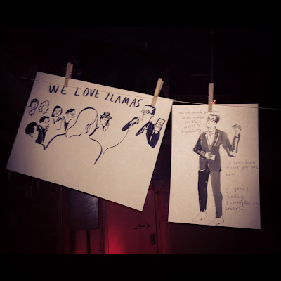
Last Sunday evening, down in the deep red-walled basement of The Book Club, independent illustration and poetry magazine inc. threw an Interactive Poetry Party. Under a low ceiling crowded with light bulbs, we listened to and collectively wrote poetry, drank, drew and were drawn at this homespun-style underground event. The crowd seemed equally in awe as I was of the acts and of the setting. The energy was palpable in the room – intermittedly tense as we held our breath listening to Zena Edwards’ melodic tones, loudly and cheerily released in shared laughter at Raphael Attar’s surreal variety hour.

Throughout the evening, illustrator-animators Phoebe May Halstead and Hannah Simpson captured the punters and performers in a series of quick pen and ink sketches. The super-talented duo transformed the night into beautifully composed, expressive little drawings teamed with lines of verse lifted from each performance.

I highly recommend a browse through Phoebe May Halstead’s animations found here. There are some really strong line drawings to be found on Hannah Simpson's site here. See also an animation by the two girls in collaboration here; it has something of The Beatles' Yellow Submarine and BLU street art without wholly committing to either and successfully holding its own style.

Learn more about inc. magazine and its brilliant, innovative founder-editors Will & Anya here. The next issue will be out later this year and will be found in stockists across London, a list of which is on their website.


Hannah Simpson and Phoebe May Halstead

Saturday 20 October 2012

MEL BOCHNER @ WHITECHAPEL GALLERY

The Whitechapel Gallery have recently opened their doors to spectacular new exhibition Mel Bochner: If the Colour Changes. Last week I was lucky enough to be accepted onto a small seminar at the gallery, which included a preview of the show before a Q&A session with the seminal conceptual artist.

The exhibition includes pieces from the 1960s to work made this year. ‘Once you recognise that my work is an analytical attempt to rethink painting’s meanings and functions,’ Bochner writes in the foreword to the exhibition catalogue, ‘you realise that it is all one continuous investigation’. But it isn’t only painting he investigates. Over an illustrious career of nearly half a century, Bochner has returned again and again to unpick the various systems of representation that we rely on in trying to make our world comprehensible. Using different media, or ‘delivery systems’ as he terms them, Bochner layers, juxtaposes, or combines these systems; cancelling or disrupting their legibility, and questioning their reliability.

Actual Size (arm), 1968 


In a formative early work, Bochner took a photograph of his arm. Recognising that in photography, ‘there is no mechanism to say what size anything is’, he placed his arm next to a line marked with a length of twelve inches. But the verifying measurement in the photograph is impossible to verify in its photographic reproduction; what is more, it is of course now false. How are we to know if it was correct in the first place? This was the last photograph Bochner ever made, but it had a decisive effect on his work as he began to consider the relationship between measurement and belief.

Three decades later, in 1998, Bochner would make Event Horizon: a series of differently coloured canvases carefully aligned across a wall, inscribed with various horizontal measurements. Bochner related how a ‘very important’ German reviewer had walked out of an exhibition of Event Horizon, furious about the artist’s use of imperial measurements. He took out a metric tape measure and exclaimed angrily, ‘But I can’t measure it! How do I know the dimensions are correct?’ Although Bochner lost the much-coveted review, he delighted in this, the ‘perfect’ response to the work: ‘[the reviewer] was seeing it as pure meaning...he realised that measurements were built on trust. At that moment, I got into his head. That’s got to be a good thing’.


Event Horizon, 1998 (section of larger work)

Many critics are keen to situate Bochner’s work in the 1960s ‘period of doubt’, a questioning of the claims made for painting as a vehicle for ‘truth’ of the psyche of the individual (Abstract Expressionist) painter, further expanded to question the ‘truth’ or objectivity of accepted systems of measurement and communication. I asked Bochner what he felt about this. Did the realisation that we had only belief in, not knowledge of, established systems have to be ‘momentarily chilling’ (Weiss) or induce a ‘nauseating vertigo’ of uncertainty (Borchardt-Hume)? Or, could his work in fact be understood as a neutral or even celebratory reflection on the communal systems we have set up around ourselves in order to better communicate with one another?

Bochner’s response to this was evasive, and somewhat unsatisfactory. ‘I don’t listen to what critics say about my work, in case it changes how I feel about it,’ he replied; then, laughing, ‘but I’m not as good natured as I’m appearing!’

This was Bochner’s response to many of the more probing questions of the afternoon. He’d start: ‘well, I’m not sure about that, but...’ and then go on to tell a relevant anecdote from his career history. At first I found this frustrating – why wouldn’t he engage us in these debates? His regular retreat to these simple stories and events seemed to be totally at odds with the deeply philosophical nature of his work. But Bochner’s refusal to reveal his own interpretations of his work is a manoeuvre to regale any notion that his ideas should be any more valid than anyone else’s, and to have his work speak for itself, rather than serve as an intermediary for the artist’s expression.

This resistance to ‘self-expression’ is seen again in Bochner's thesaurus paintings, where he ‘lets the language speak for itself…without interference’. In these works, Bochner uses Roget’s Thesaurus to generate colourful word chains. The language deteriorates as the eye follows the text downwards, as the terms become increasing colloquial and often vulgar: ‘I start with a formal, neutral word’ Bochner explained, ‘and let it fall apart’. The language is active, and the paintings almost performative – whether spoken out loud or read silently the words and phrases seem to have a voice of their own. And yet of course we imagine or project the tone of this voice through our own associations.

Language systems, like measuring systems, are in Bochner's work revealed as fallible, and subjective: ‘That language is a direct conduit to thought, short-circuiting emotion: this is a fallacy. Language is not transparent; it is full of ideologies’. In seeing so much of Bochner’s work brought together in this new exhibition, it is impossible not to join the artist in his interrogation of these ideologies and accepted ‘truths’. Definitely worth an afternoon’s deep thinking.

Mel Bochner: If the Colour Changes runs until 30th December.

Babble, 2011

Sputter, 2010

Die, 2005

Oh Well, 2010


Wednesday 10 October 2012

SCOTT CAMPBELL @ OH-WOW


To coincide with the Frieze weekend and the consequential influx of art collectors to London over the next few days, Los Angeles-based OH-WOW are exhibiting some of Scott Campbell’s works in a pop-up gallery on Hanbury Street E1. Go past the glass-fronted space and you see some strikingly high-shine, high-resolution C-prints of the moon - fifteen in all – showing sequential stages of its waxing and waning. Is this another work that takes interplanetary relations for inspiration? Could the meditation on the galactic be a recurrent preoccupation of artists of 2012?


But wait – go inside, draw closer and everything changes. The works are not glossy photographs of planetary craters but thin, unevenly carved discs of foam sunk into resin. Look closer still to find that what you thought were the untouched surfaces of a remote landmass are apparently not so remote – they have been defaced, with the type of amateur graffiti found on the back of a toilet door or in a teenage diary. ‘I MISS YOU GUYS’ etched on a gravestone, crossed hearts, rainbows, NO WAY JOSE in bubble writing, a scrawled LOL ASAP 4EVA.

Scott Campbell is a tattoo-artist by trade (to the stars apparently), but he has made a whole host of artworks that play with the tropes of popular culture. His works aren't anything particularly groundbreaking in their contribution to critical theory perhaps, but they can be quite entertaining – at least for you to say ‘oh wow, that’s cool’ and then be on your way. That was my experience today anyway.

I’ve ruined the surprise, but only to get you to go – OH-WOW will fly back across the Atlantic after 13th October. See their press release for this show here.


Tuesday 9 October 2012

FIRST THURSDAYS: OCTOBER 2012 EDITION

The longest-running and most broadly-spanning of the monthly late-night openings, East London's First Thursdays came round again last week. Visitors were welcomed (often with a glass of beer or cheap wine) into a breadth of exhibitions extending from Hackney Downs’ E8 to Canary Wharf’s E14, from the EC1s of Clerkenwell over to the extreme-easterners of E15 - all until the ripe old hour of 9pm.

This month I bypassed the trendy-artistic hubs of Hoxton and Shoreditch to visit Bethnal Green. Just down from Cambridge Heath train station, multi-purpose arts and events gallery Oval Space were showing Joint Ventures, an exhibition to showcase the collaborative practice of seven different artistic partnerships. The works are varied: of watercolour, C-prints, video and Super8, photography, sculpture, installation  and performance, none forego representation. Perhaps the diversity of the works is due to the focus of the exhibition on process rather than product. Interestingly however, the process of collaboration itself is not evident from the pieces’ appearances, neither do any of the participating artists treat it explicitly as a theme.

Two particularly ambitious works caught my attention. Xavier Poultney and Hannah Barton hired a walk-in cooler into which we were invited to walk, one by one, with only a small, handheld night vision apparatus as an ocular guide. It is pitch black, and the temperature is -20°C. In other words, you are near-blind, alone, and it is extremely cold. After gaining confidence to move, you crash into a box in the centre, or think you see something on the wall. Temporary terror strikes when, briefly, you cannot find the handle to the door. Lost in this nothingness, even your body seems to have dissolved; I kept trying to find my shoes through the weak eye of the night vision monocular.

Elsewhere in the exhibition, a work by the ARKA group (a collaborative practice between Ben Jeans Houghton and Matthew de Kersaint Giraudeau) also plunges us into darkness. Viewers are invited to put on a thick felt hood and ‘listen to a conversation between themselves and the universe’ through large headphones, holding a small meteorite in their hands. The meteorite is heavy, and warm from the previous person; the rumbling voice (male) growls: ‘you cling to the rock, as it clings to you’. Again we are made to pause and think of our relation to our environment, this time on a galactic scale.

Of course, not all of First Thursdays’ visual offerings will be as stimulating. Just up the road The Arch Gallery exhibited Jonathan Parsons’ slightly bland colour-pencilled graphics and A-Level standard symbolism (letters spelling ‘live’ or ‘evil’ depending on your position in the room and dripping with red paint); nearby Cell Project Space showed a video by Mark Aerial Waller, which was either terrible or brilliant, I couldn't decide (have a look for yourself here).

Whatever your conclusions, First Thursdays provides excellent exposure for lesser-known spaces and artists. The next will be, perhaps predictably, on Thursday 1st November 2012. See this map for participating spaces...plan your trip well!


NIL, Xavier Poultney + Hanah Barton 

Beginnings, The ARKA Group

Joint Ventures runs until 14th October 2012.


Wednesday 26 September 2012

RUNA ISLAM @ WHITE CUBE HOXTON SQUARE

Walking into Hoxton Square White Cube is a bit like entering a weird, abstracted version of a History of Art lecture. White-grey light from two slide projectors flickers through the otherwise dimly-lit space of the ground floor; quietly rhythmic, click-clacking slides take us through a series of images. Today’s topics: plain wall with skirting board; small painting hung on wall; large piece of propped-up Perspex. A bronze head; the same image rotated; a close up of the eye. What do these slides really tell us about the spaces and objects that they are representing?

Ways of seeing, ways of teaching, ways of reproducing images and knowledge: these boundless areas of debate in critical art history form the backbone of any half-decent undergraduate course in the subject. Artist Runa Islam, whose exhibition opened at White Cube last week, adds her contribution to these ideas in a selection of works produced especially for the gallery. Islam denies her viewers any clear or specific narrative; rather than passively absorbing information presented to us, we are to consider the usual processes of that absorption. Watching her 35mm films is like attending a lecture without a lecturer. But rather than being liberating, the experience is somewhat uninteresting.


The exhibition's opening night last week was a raging success...at least for Peroni. Scores of people standing outside of the Hoxton Square gallery space chatted over small green bottles of the tasty Italian beer. Perhaps predictably, the gallery itself was less densely populated, with only a few visitors (some slightly swaying) half-interestedly surveying Islam’s work.

Don’t get me wrong – I love a good vernissage. Contemporary art and free booze can pretty much be summed up as a winning combination. It is only when the exhibition-viewing becomes subsidiary to the drinking do you get the feeling something might have gone a bit awry in the event planning.

Or maybe we need a little more meat from an exhibition than only the slightly tired self-conscious analysis of communication through artistic media. 


Runa Islam, White Cube Hoxton Square runs until 3rd November.


Sunday 23 September 2012

JR

‘Can art change the world? Maybe not in one year, that’s the beginning. But maybe we should change the question. Can art change people’s lives? From what I’ve seen this year, yes’ - JR

Supercool French artist JR has just this week opened a new photobooth in Gallery Perrotin, Hong Kong as part of the Inside Out project. It’s a really straightforward idea: have your photo taken, collect your four-foot poster, paste it where you wish.  
JR himself laughs at its simplicity: ‘paper and glue, as easy as that!’.

Connaught Road footbridge, Hong Kong

As with all of the photobooths, the Hong Kong photobooth is open to the public and free. So far over 100,000 posters have been printed (2/100,000 are mine, from the photobooth at the Pompidou last year). JR is only the facilitator of what is really a global, collective movement. He passes the project both literally and metaphorically into the hands of others. Inside Out is at once a celebration of human diversity and an investigation into the impact of images in different every day contexts.

In his TED talk from March 2012, JR demonstates the international nature of his work and how the project can be and has been adapted to the specific political and social situations of different countries. JR's enthusiasm is infectious. There aren’t enough visual art talks on TED. (I must have watched the Vik Muniz one about ten times)

I LOVE JR!

Rio de Janeiro, Brazil

McEwan Hall, Edinburgh, Scotland


Saturday 22 September 2012

EAT ME: LONDON DESIGN FESTIVAL 2012


Galleries, studios and department stores across London have this week opened their doors to showcase and celebrate cutting-edge contemporary design, under the scarlet banner of London Design Festival 2012. From futons to footwear and armchairs to chocolate, nothing is left untouched by LDF’s comprehensive programme of events. Masterful combinations of aesthetics and utility are to be found in exquisitely manufactured items all over the city (my personal favourite can be found here). But design of course can be extended beyond cherished objects to things more perishable and even...consumable.

Food designer Linda Monique has created a banquet to be served up in four courses in different locations in the Andaz Hotel this week. The dishes are visually spectacular, with colours and compositions as exquisitely balanced as anything you might expect to be served from the menu of the five-star hotel. But this is dining with a difference. Each course has been made up of ‘scraps’: products habitually thrown away by the Andaz kitchens. Rinds, yolks, crusts, pumpkin skin and even bones are among the peculiar ingredients used. Even the accompanying wine would usually be ‘scrapped’, coming from bottles with damaged labels which by law cannot usually be served.

I met Monique in Andaz’s dazzling 1901 restaurant to discuss the Scrap Lab project over one of her delicately decadent Club Sandwiches. Monique is extremely well turned out, well-mannered and well-versed in presenting her work. In her own typically succinct articulation, she hopes to find and promote ‘innovative ways of re-using products and making iconic dishes’ whilst also ‘showcasing issues surrounding laws and institutions’. 

Linda Monique at 1901 Restaurant, Andaz Hotel Liverpool Street

As the press release for Scrap Lab promised discussion on food sustainability ‘throughout the evening’,  I was under the impression that Scrap Lab could be understood as a type of food-debate-performance project – like one of Rirkrit Tiravanija's home-cooked dinners, without the wanky art elite and with a prerogative to spark discussion on a particular issue. But Monique rebuffs terms like ‘eco’ and ‘sustainability’ seeing them to be ‘used in vain in so many instances’. Scrap Lab should be seen more as a business plan than an artwork. Asked whether this was a project which she hoped to initiate in other restaurants and institutions, Monique replied instantly ‘very much so’ only then admitting ‘it does take a long time to understand institutions and to redefine the ways they use food’. A long but worthy process if it begins to affect corporate and institutional approaches to food and wastage.

Sea bass cheek with cucumber skin jelly, lime zest, and bread crumbs from cut-off sandwich crusts


Monique’s Club Sandwich, in a lively twist on the British classic, is in fact served as a dessert, with thin slices of sponge sandwiching blueberry mousse, mint and strawberries. Served with a portion of thin doughnut ‘fries’ and raspberry and white chocolate ‘ketchup’ and ‘mayonnaise’.


If fish heads and marinated ribs don’t appeal, around the way on Baldwin Terrace, Studio Toogood are host to another food design project: the M25 Luncheon, a project from Milan-based experimental food designers Arabeschi di Latte. The concept is relatively simple – of the menu of four re-vamped Ploughman’s lunches, all of the products are sourced from within the M25. Each menu is based around a different combination of chutney and cheese, accompanied by a couple of other handsome ingredients such as smoked salmon, a pickled egg, or a drippingly syrupy cube of honeycomb. All are artfully arranged on a slab on concrete and to be eaten off your knees.

M25 Luncheon: pared-down design

MENU 1: Cheddar cheese + honey comb (from a hive on the roof of an ex-council block in Tower Bridge) 
+ ham + white London bread + pear and walnut chutney


MENU 3: Childwickbury cheese + smoked salmon (from a smokehouse in Stoke Newington) + pickled beetroot + 100% rye bread + nutty plum chutney


Both my friend and I kept repeating ‘it’s delicious…this is really good…that was delicious’ to sort of compensate for the fact that we had essentially each spent a tenner on a piece of cheese on a piece of rock. It’s a particularly ‘trendy’ approach to food with its à la mode local sourcing and contemporary/rustic design, but it does make for a different dining experience. The ploughman's lunch feels oddly bespoke, unique, something made for you personally. M25 Luncheon even has its own ‘scrap’ element as the chutneys are made from surplus market fruit and vegetables before they are discarded.

Both Scrap Lab and M25 Luncheon make us think through food, using rituals of conviviality with a greater purpose to increase our attention to where the food came from, not just where it’s going. Food design to change your thinking.


Lunch on the canal - the back entrance to Studio Toogood

Linda Monique’s installation Eggcentric can be seen at the Andaz Hotel, Liverpool Street. She is currently negotiating with Andaz to have her delectable club sandwich become a permanent fixture on the restaurant menu.

Arabeschi di Latte do some really fantastic projects, more about which can be found here.